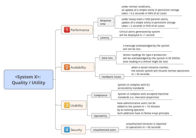
In previous versions of this tip, we proposed a graphical quality tree. Now, a few years later, we favor a simple table instead of the graphics.
A discussion of our reasons lies beyond the scope of this documentation. In short: Our own pragmatical quality model Q42 makes use of tags/labels instead of a strict hierarchy. That proved to be a major improvement over the graphics.
We propose to keep arc42 section 1.2 (quality goals) short, there you show only the top 3-5 quality goals, with priorities.
Here, in arc42 section 10, we go into more detail:
- Show your most important quality goals and -requirements (if you’re a mindmap- or graphics fan, use a graphical version)
In software engineering literature, e.g. from the Software Engineering Institute, such tree-structures have been named Quality Attribute Utility Tree. They are integral part of the ATAM architecture analysis and evaluation method, which many people consider overly formal and slow.

Such a tree can provide a good overview of required qualities, it can document focus points. If it grows larger, all overview gets lost - and a simple table will win.
Further references
-
Arnon Rotem-Gal-Oz has written up a more detailed explanation of the quality tree.
-
The pragmatic quality model, quality.arc42.org
